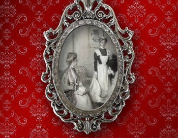
Along with the title, I knew that the cover of my book was going to be the most important way of conveying to the potential buyer the genre and sub-genre of the book. For example, the cover needed to signal that it was set during the Victorian era. It also needed to indicate the tone of the mystery. I wanted the reader to know that Maids of Misfortune wasn’t going to be the dark, twisted tale that had become the hall-mark of the Victorian era mysteries by Anne Perry, but rather it was more like the Agatha Christie’s Miss Marple mysteries, with an amusing cast of secondary characters and even a cute dog. There was no cozy mystery category on Amazon at that time, so my cover, along with the titles, would be doubly important in attracting the right reader.
I also knew that the cover had to look professional, which was particularly crucial if I was going to ask people to take a chance on the first book by an unknown author. I also knew I didn’t have the skills to develop such a cover.
What I did have was a new friend and neighbor, Michelle Huffaker, who had a design degree. Along with raising three children, Huffaker was doing some freelance web design work, and when I asked, she agreed to give designing covers a try. An added bonus was that she liked the kind of light fiction I had written and was glad to read the manuscript of Maids of Misfortune before starting to work on the design.
I couldn’t have been happier with the results.
Before meeting with Michelle Huffaker to discuss the cover, I spent a couple of days looking at the covers of historical mysteries that I had read and concluded I didn’t want to copy any of them. They were either empty landscapes (dark urban scenes or rural cottages) or the obligatory couple against a vague background that said romance, but not mystery. One author’s books didn’t stand out as different from any of the others.
If I had been traditionally published, I would have had little, if any, ability to push back against these trends, particularly as a first time author. Even later with the one contract I did get with a publisher (a German translation of Maids of Misfortune through an Amazon imprint), they used a stock photograph of a woman (that I have seen on other covers). It isn’t a bad cover, just not particularly distinctive.
If you are interested in reading about the difficulty authors have over input into their covers when traditionally published, here is an amusing recent article by a very successful contemporary writer, Jennifer Weiner, detailing her struggles over decades of publication.
However, as an independent author, I didn’t have to answer to a publisher, and I came up with my own vision for Maids of Misfortune.
First, I decided I wanted the background of the cover to look like Victorian wallpaper, using a deep red, which is a signature color of the Victorian period. Next, I decided that in center of the cover should be an illustration I had found in a late Victorian magazine of a mistress and servant. The illustration (versus a photograph or painting) would signal the 19th century period and the subject matter would reflect the occupation that was the main feature of the mystery.
I gave Huffaker a sample of Victorian wallpaper I had found online and the illustration, and she took it from there. If you look closely at the cover on Maids of Misfortune, you will see that she manipulated the classic Victorian pattern she found so that the edges were darker than the center. As a result, it really looks like the kind of fading you would find in old wallpaper. She also researched Victorian fonts, finding a font that not only stood out, even in small thumbnails pictures, but also evoked the nineteenth century. And she placed the black and white illustration into an ornate frame, again historically accurate, so that it looks like you are seeing a reflection in a mirror.
I loved the cover, which really brought my vision to life.
I firmly believe that the early success of this book came from the cover’s ability to entice readers to take a chance on an unknown author. Perhaps even more significant, the design Michelle Huffaker and I came up with also turned out to be a design that could be used in book after book. In short, we had the successful beginnings of a brand for my Victorian San Francisco Mystery series.


I'm often disappointed to see a shelf full of published books by different authors with covers that could literally be interchangeable. I don't even know if the stories are similar, but I don't feel compelled to pick any of them up based on the cover art. Your covers are distinctive, true to your vision, and they speak to the tone and content of your books. To think a publisher would push back on a triple threat design like that is baffling. More proof that your decision to write your own publishing destiny was the right one!
Yes, your covers are well-designed and distinctive (and genre-appropriate). Good job.